
Color is one of the most potent tools in the designer’s arsenal. It not only creates an aesthetic appeal but also evokes emotions, influences behaviors, and communicates messages without saying a word. Understanding the psychology of color is essential for crafting meaningful, effective designs in everything from branding and marketing to interior design and website development. In this article, we’ll explore the impact of color in design, how different colors evoke specific psychological responses, and how designers can use color intentionally to shape user experiences.
The Psychology of Color
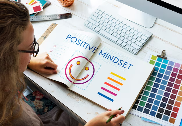
Color psychology is the study of how color affects human emotions and behavior. It suggests that colors can influence mood, perception, and even decision-making. While cultural context and personal experiences play a role in how we perceive colors, there are some universal responses to color that designers can leverage.
Here’s a breakdown of how different colors typically evoke certain psychological effects:
- Red
- Emotion: Passion, energy, urgency, excitement
- Impact: Red is a highly stimulating color, often associated with strong emotions like love and anger. It grabs attention and is frequently used in marketing for sale signs, clearance events, or in call-to-action buttons. It can also signify danger or warning (think of stop signs or emergency vehicles).
- Usage: Ideal for brands wanting to convey excitement or urgency, like in the food, entertainment, and retail industries.
- Blue
- Emotion: Calm, trust, professionalism, reliability
- Impact: Blue is known for its calming and stabilizing effects. It is often used by financial institutions, healthcare providers, and tech companies because it invokes trust and security. Lighter blues are seen as peaceful, while darker blues have a more corporate and professional feel.
- Usage: Best for brands that want to project stability, trust, and competence.
- Yellow
- Emotion: Happiness, optimism, attention-grabbing, caution
- Impact: Yellow is an energetic and attention-grabbing color. It is associated with warmth and optimism but can also symbolize caution (think of traffic lights or warning signs). Too much yellow can be overwhelming, so it’s often used sparingly in design.
- Usage: Effective for brands aiming to inspire positivity, like in the food, entertainment, or children’s products sectors.
- Green
- Emotion: Nature, growth, health, tranquility
- Impact: Green is often associated with nature and is seen as calming and peaceful. It represents growth, renewal, and sustainability. Darker greens convey affluence, while lighter greens evoke freshness and health. It’s also a popular color in the environmental and organic sectors.
- Usage: Ideal for brands connected to wellness, the environment, or finance.
- Orange
- Emotion: Enthusiasm, creativity, warmth, fun
- Impact: Orange combines the energy of red and the cheerfulness of yellow. It evokes feelings of fun, creativity, and enthusiasm. It is often used to encourage action, such as in calls-to-action or special promotions.
- Usage: Best for products or services targeting younger audiences, or those in creative, energetic fields like technology, entertainment, and sports.
- Purple
- Emotion: Luxury, creativity, mystery, spirituality
- Impact: Purple is traditionally associated with royalty, luxury, and wealth. Lighter purples, like lavender, evoke a sense of calm and creativity. Purple is also linked to mystery and spirituality, making it a popular choice for premium brands or artistic endeavors.
- Usage: Great for high-end products or brands that wish to convey a sense of exclusivity or creativity.
- Black
- Emotion: Sophistication, power, mystery, elegance
- Impact: Black is a color that can be both bold and refined. It represents sophistication and elegance, and it can also symbolize power and authority. While it can be a bit heavy, black is often used in luxury branding or to create a dramatic, sleek look.
- Usage: Perfect for high-end brands, luxury goods, or to create an air of exclusivity and sophistication.
- White
- Emotion: Purity, simplicity, peace, cleanliness
- Impact: White is seen as pure, simple, and clean. It often represents new beginnings and a blank slate. In design, it’s commonly used to create spaciousness and to make other colors pop. It’s also linked to concepts like peace and tranquility.
- Usage: Ideal for minimalist designs, health and wellness brands, or to convey a sense of simplicity.
- Pink
- Emotion: Femininity, softness, love, nurturing
- Impact: Pink is often associated with femininity and nurturing qualities. It’s a color that evokes softness and compassion, and is often used in designs related to beauty, fashion, and wellness. Pink can also be seen as playful or romantic, depending on its shade.
- Usage: Effective for brands targeting women, children, or in the beauty and fashion industries.
The Impact of Color in Branding and Design
Color plays a critical role in branding, as it can influence brand perception and consumer behavior. In fact, research suggests that color can increase brand recognition by up to 80%. It helps create an emotional connection with the audience, reinforcing the message or personality a brand wants to convey.
- Consistency: Color consistency across various touchpoints (website, social media, advertisements) helps reinforce brand identity and makes the brand instantly recognizable.
- Cultural Sensitivity: Colors may have different meanings in different cultures. For instance, while red is seen as a symbol of luck and celebration in China, it may represent danger or warning in Western contexts. Designers must be mindful of cultural nuances when selecting colors for global brands.
- Contrast and Accessibility: Proper use of color contrast is crucial for readability and accessibility. High-contrast color schemes can make text and visuals stand out, while low contrast can make them difficult to read. Accessibility guidelines recommend using color combinations that are easily distinguishable by individuals with color vision deficiencies.
Using Color to Enhance User Experience
Color isn’t just about aesthetics—it directly impacts user experience. When designing websites or apps, color can guide user behavior, improve navigation, and increase engagement. For example:
- Calls to Action: Bright, contrasting colors like red or orange can draw attention to important actions, such as “Sign Up” or “Buy Now” buttons.
- Visual Hierarchy: By using different shades or tones of a color, designers can create a visual hierarchy that guides the user through the content. For instance, headings may be in darker colors to draw focus, while body text remains in softer hues for ease of reading.
- Mood Setting: The color palette chosen can set the overall mood of the site or product. A spa website might use soft blues and greens to create a calm, relaxing atmosphere, while a gaming website might use bold, energetic colors like red and black to evoke excitement.
Conclusion
The power of color in design is undeniable. Its psychological impact can make a design more engaging, communicate a brand’s message effectively, and influence consumer decisions. Whether it’s through branding, web design, or marketing materials, color helps shape perceptions and elicit emotional responses. By understanding color psychology and its effects, designers can create more impactful, memorable, and user-friendly experiences.
Incorporating color thoughtfully into design is not just about making something look good—it’s about making something meaningful and effective.